Make Animation Accessible
It is common to have animation on your slides, but screen reader users rely on the correct reading order and detailed alt text.
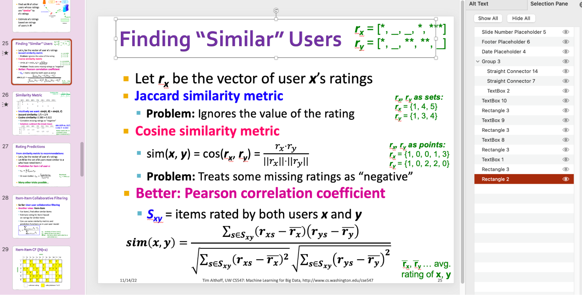
In the example below, the slide sequentially displays the formulas for “Jaccard Similarity Metric,” “Cosine Similarity Metric,” and “Pearson Correlation Coefficient.” With each animation, the corresponding examples (i.e., $r_x$, $r_y$) are revealed in green text on the right-hand side of the slide.

1. Check the reading order.
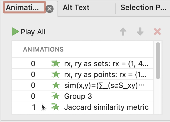
Make sure that the reading order follows the animation order: the first element in the reading order should be the first element animated. Below is the animation order in the Animation Pane.

2. Avoid adding animation inside of one single text box.
Don’t add animation inside of one single text box. For example, don’t lump all three similarity metrics into one giant text box and add animation inside. Instead, create three text boxes, each of which represents one metric. Having separate components makes it easier to adjust the reading order.